TABLEAU · Apple
CEMEA PulseCEMEA Sales Performance Dashboard
CEMEA sales performance lived in a fortnightly spreadsheet pack that took two days to assemble and was out of date the moment it landed. I rebuilt it as a governed Tableau model with a single certified data source, so channel leads, country managers and the BPR team all read the same numbers on the same morning.
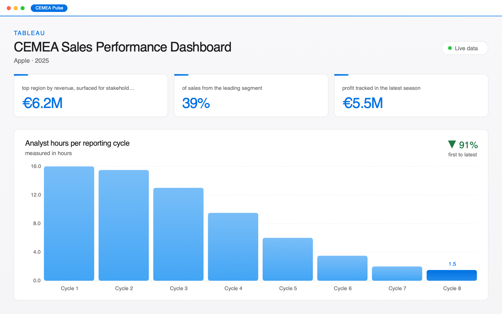
- €6.2M top region by revenue, surfaced for stakeholders
- 39% of sales from the leading segment
- €5.5M profit tracked in the latest season
01 — Context
The problem.
Sales reporting across Central Europe, the Middle East and Africa was assembled by hand. Four regional teams each kept their own extract, each with a slightly different definition of net revenue, and the consolidated pack was rebuilt from scratch every fortnight. Two analyst days went into copy-paste alone.
The consequence was not just cost. Because every team arrived at a review with its own workbook, meetings opened by reconciling numbers rather than deciding anything — and by the time the pack was signed off, the underlying data had moved on.
02 — Method
The approach.
The build, in the order it happened.
-
One certified data source
I mapped every field in the four regional extracts back to source, agreed a single definition for net revenue, margin and segment with the BPR leads, and published it as one governed Tableau data source in BigQuery. Nothing downstream is allowed to redefine a measure.
-
Automated the collection step
The three inputs that only existed behind an internal portal are now pulled by a scheduled Playwright job that logs in, exports, validates row counts against the prior run and fails loudly rather than publishing a short file.
-
Designed for the review, not the archive
The overview answers the three questions asked in every business review — where is the revenue, what is the segment mix, is margin holding — above the fold. Everything else sits behind a drill-through, so the dashboard opens in under two seconds on a laptop.
-
Handed it over properly
Two training sessions per region, a one-page definitions sheet next to the dashboard, and a named owner for each tab. Adoption was measured, not assumed.
03 — Outcome
What changed.
- The €6.2M top-performing region and its 39% segment concentration became visible for the first time in a single view, and reshaped how quarterly targets were set.
- €5.5M of seasonal profit is now tracked continuously rather than reconstructed after the fact.
- Pack assembly fell from roughly 16 analyst hours a fortnight to a scheduled refresh and a validation pass — about an hour and a half a cycle by the eighth.
- Weekly active users grew from 9 to 74 across the region within two months of rollout.
04 — The numbers
Analyst hours per reporting cycle.
Tracked as hours, from Cycle 1 through Cycle 8 — low 1.5, high 16.
05 — Screens
What it looks like in use.
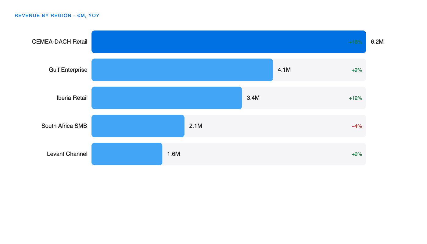
Top performers — ranked by contribution, with year-on-year growth alongside so a big number and a falling number are never confused.
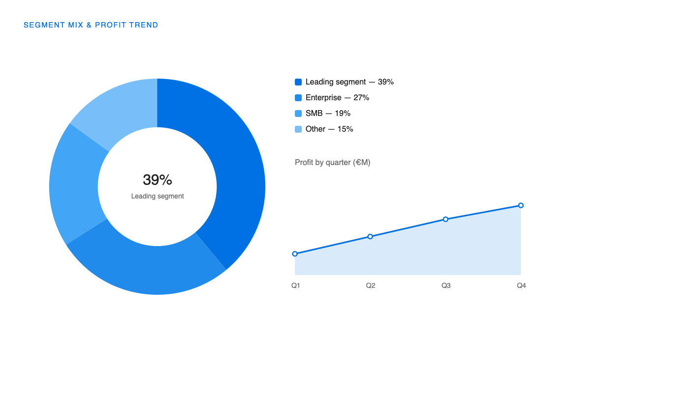
Margin detail. Revenue mix and profit sit on the same page because the interesting cases are the ones that move in opposite directions.
06 — Stack & role
Built with.
- Tableau
- SQL
- Google BigQuery
- Python (Pandas, Playwright)
- Microsoft Excel
- Role
- Data analyst — model design, dashboard build, stakeholder rollout
- Duration
- 11 weeks
- Client
- Apple
- Period
- 2025
07 — Questions
The questions I get asked about this one.
The audience was a few dozen non-technical stakeholders who needed to slice a governed model, not build their own. Tableau’s certified data source and row-level permissions were the deciding factor, and the team already had licences.
Every measure lives in the published data source, not in a workbook. Local calculations are reviewed before a workbook can be certified, and the definitions sheet is versioned next to the dashboard.
The ingestion job asserts on schema and row count. A failed assertion stops the refresh and notifies the owner — a stale dashboard is recoverable, a silently wrong one is not.